So a few weeks ago, I saw a post from an illustrator I follow on Facebook about a potential job. It was just a one-day thing involving drawing on a store-front window. It paid well. I thought it sounded fun. And, between the drawing-in-public-with-people-literally-watching-over-my-shoulder aspect of it and the honest assessment that there are many talented artists in LA who can draw circles around me...it was also terrifying.
Which meant that I had to apply, of course. I spent an evening sketching, and then I submitted.

This isn't that big of a deal from the outside, but it was a big deal to me. Nobody can produce hours upon hours of consecutive top-notch drawings...or at least that's what I told myself...so I had some sketches that were better and some that were not. Turns out that non-artists are easily impressed, though, so I had that going for me. And because of that, just this one simple job has already opened up a couple of exciting doors for me (including the probable opportunity to do this job again).
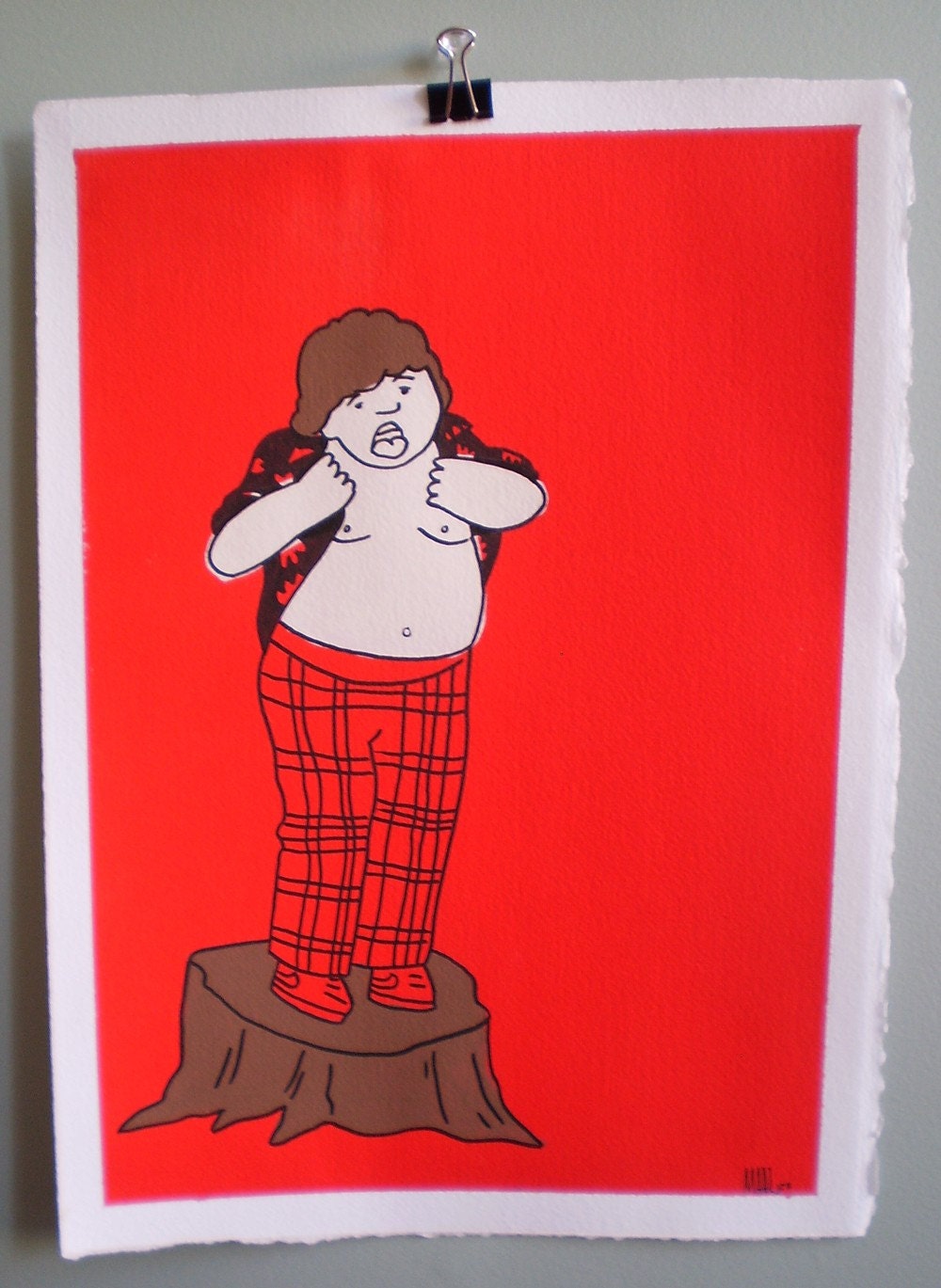
 |
| I am this human. |
After drawing shaving products on a window for 4.5 hours straight, I was starving. And after doing something scary for 4.5 hours straight, I was exhausted. I decided to get some food. (Sidenote: When you're single and childless, eating out alone might sound depressing. But when you're the mother of young children, it is a joyous occasion. You don't have to cook OR be simultaneously in charge of the nourishment, table-manners, and choking-evasion of multiple humans.)
 |
| This is my cousin's adorable daughter. |